a tiny project

In many offices, the weekly ritual is someone bringing in two dozen donuts — boxes stacked on the counter, almost always wrapped in pastel colors. That's not accidental. The pink donuts, pink boxes, and soft pastel packaging: that's quiet psychological work.
Accidental Branding
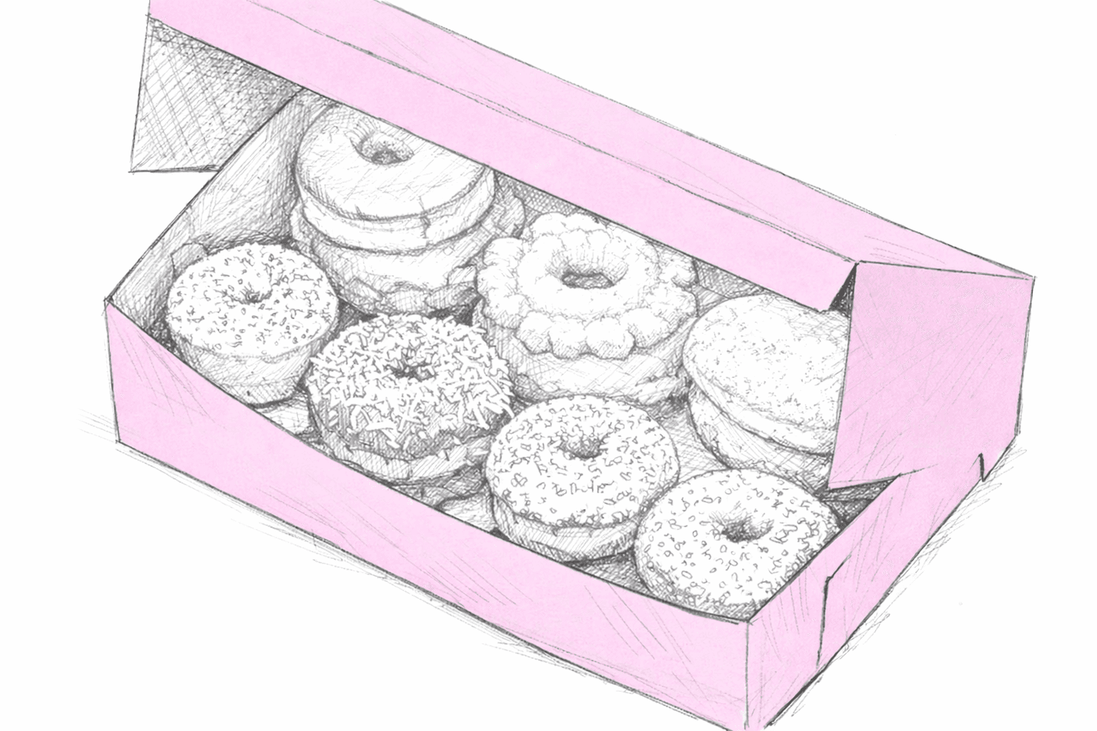
Pink frosting, rainbow sprinkles, soft pastel packaging — it all blends together into a visual shorthand for sugar and indulgence. Those warm colors naturally nudge the brain toward appetite. Pink sits in that strange middle ground between warmth and playfulness. It signals sweetness without feeling heavy or decadent — more like a treat than a dessert.
From Pink Box to Desk
That small moment of joy encoded in a pastel box left on a breakroom counter is what inspired this mouse pad.
A child with a butterfly net, repurposed as a donut net, standing in a landscape made entirely of pink donuts, catching them as they fall through the sky.
It's the psychological charge of pink, the visual shorthand for sweetness and play, carried from the bakery into the workday.
